Let's look at how to make retail promotions easy to identify and navigate for customers.
From the run-up to Black Friday, all the way through to the Christmas shopping season and beyond, many ecommerce sites and online retailers will be running sales and promotions of various kinds.
Promotions play an important role in attracting visitors to your site and tempting them to buy once they arrive. However, it’s important to ensure that sales are easy to navigate and that promotional offers are clear and easy to apply.
In this article, we’ll look at how retailers can ensure that promotions are communicated effectively, and are usable for visitors.
First of all, promotions should be easy to find. If promotions are the current focus of your holiday campaigns, then they should be obvious when users land of the homepage.
If you’re promoting them from paid search ads, emails and elsewhere, make sure users are sent to a page where they can view offers.
Even better, adding simple navigation options, such as sending visitors to the men’s or women’s section of the sale makes it easier for the user.
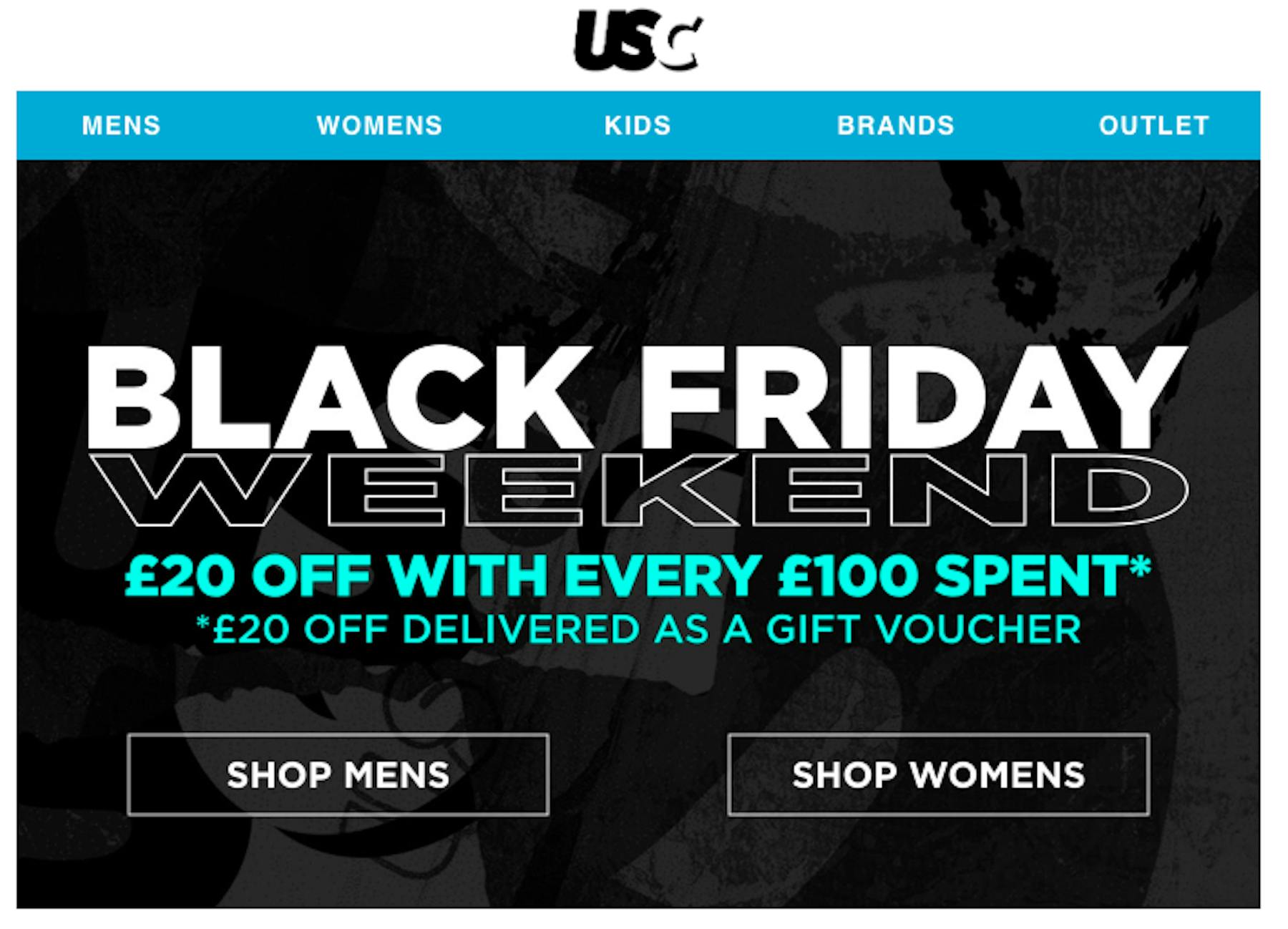
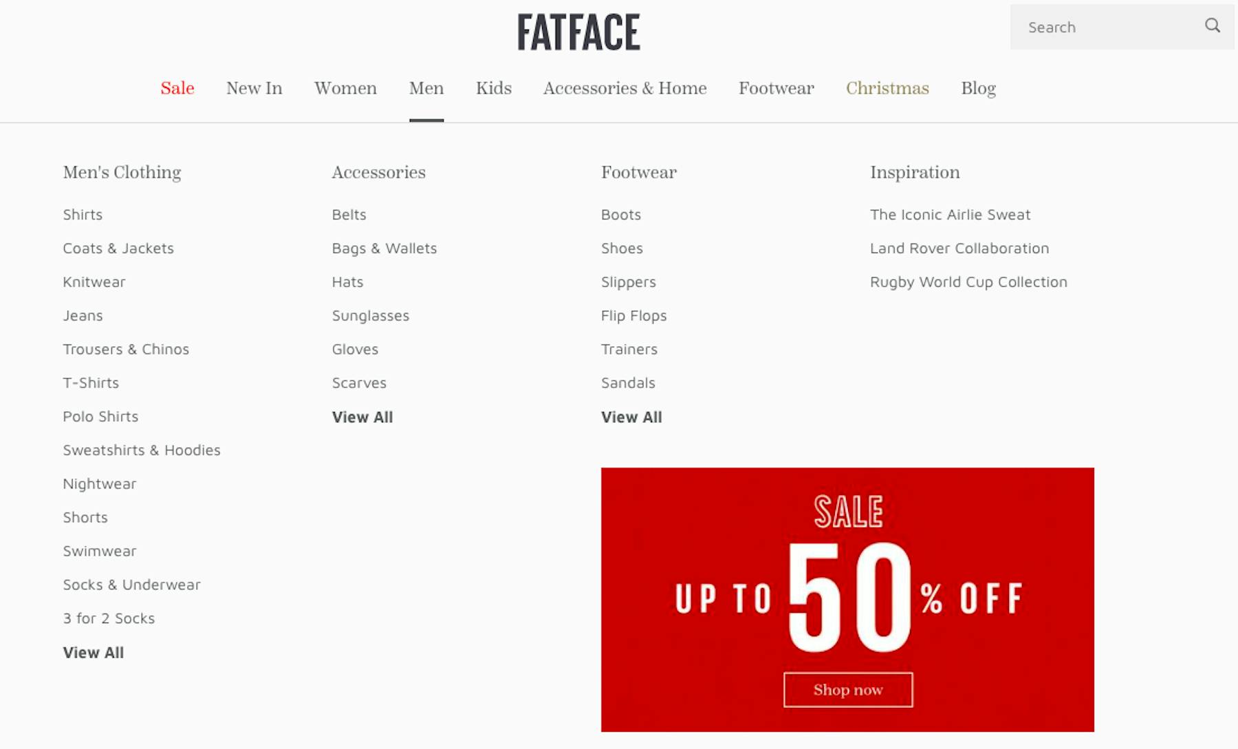
For major promotions, it pays to advertise them throughout the site so that shoppers see your offers, whatever the page they happen to land on.
Persistent reminders of discounts help users to find items that match their budget and encourage shoppers to buy. It also ensures that all users are aware of promotions.
Here, FatFace promotes its current sale, whichever section users land on or navigate to, even in drop down menus. It’s impossible to miss.
Discover the winners in our competitive UX measurement report
Site-wide promotions can shown in the ‘hero space’ on the homepage and category pages, something which is suitable for big sales events like Black Friday.
Offers can also be promoted via site header banners. This is great for things like a free delivery threshold or site-wide promo code offers. In the latter case, repeating these on basket and checkout pages where codes can be entered reduces effort for users.
Some sites will just show all promotional items at once, so it’s a simple case of first come, first served for shoppers. This results in a lot of interest at the beginning of the sale, but then drops off.
However, if sites want to maintain customer interest over a longer period, or try to stagger the amount of traffic, then daily deals and rolling promotions give people a reason to keep returning.
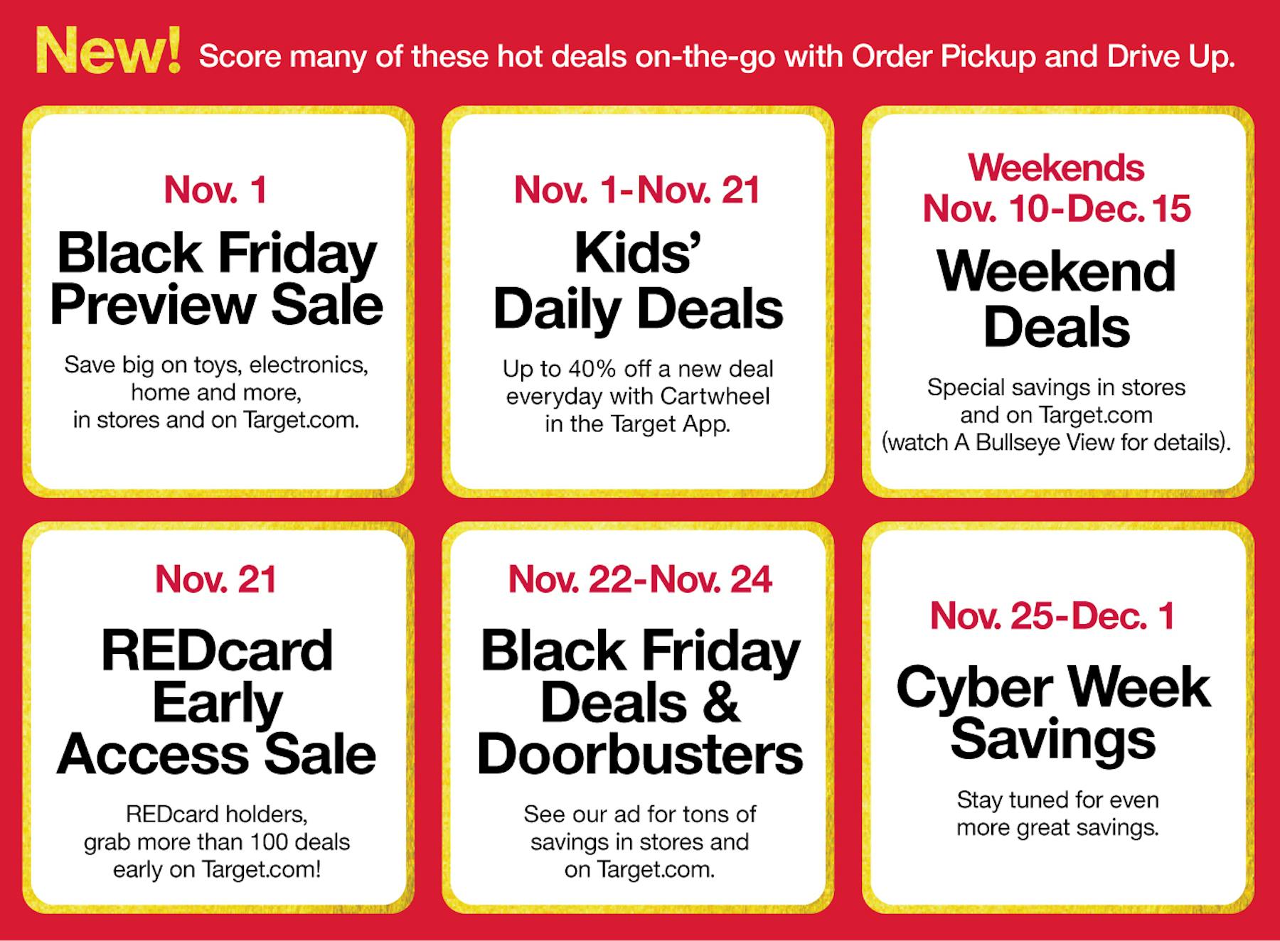
Daily deals are useful in high traffic periods like Black Friday, allowing retailers to tempt visitors to make multiple visits, while the time-limited nature of the sales encourages shoppers to buy before that day’s deals run out.
Some visitors will just want to see products on sale and nothing else, so separate sales categories should allow them to view all offers, and navigate through this section.
Many online retailers use urgency marketing tactics during sale periods, but it’s important to consider the user.
Using urgency methods like countdown timers as Amazon does on its Daily Deals, can encourage people to make a fast purchase decision, but it is important not to overdo it.
Urgency messaging such as the countdown timers used by Amazon, or displaying stock levels on sale items can provide useful information to shoppers, but if they’re overdone, the messages lose their value, and the customer will lose trust in the retailer.
Some visitors will just want to see products on sale and nothing else, so separate sales categories should allow them to view all offers, and navigate through this section.
Filtered navigation options should allow shoppers to sort and filter within sales sections to narrow the selection effectively.
Without filters, sales shopping can be hard work. In the example below, users can only narrow by men, women and kids.
There are more than 60 pairs of shoes in the men’s section, so without the ability to filter by size, price, brand and so on, this expects the user to make a lot of effort.
Some promotional offers might be subject to certain restrictions. They may require a minimum spend, or might only apply to certain brands or product types.
Links should be provided to more detailed information on any conditions, but they should also be explained clearly – don’t expect users to read through the small print.
If they reach checkout only to find an offer they expected has not appeared, they’ll often feel cheated.
Minimum spend promotions, where discounts are applied or free delivery offered for spending above a certain threshold, are great for boosting average order values.
To make them more effective and easier to use, it’s good to offer help to shoppers, highlighting clearly how much more they may need to spend to qualify, as Waterstones does here.
Sites could go even further, by suggesting relevant items that would allow the shopper to hit the minimum spend target and save them effort.
It should be as easy as possible to apply discounts, to avoid the risk of frustrating customers.
Any discounts customers choose, or qualify for, should be applied immediately, rather than waiting until the later stages of checkout. Leaving it late adds doubt in the customer’s mind.
Promotions are often applied in the form of voucher codes, which requires a little extra work from customers.
They need to either remember codes from where they first saw them, or copy and paste them ready for the code box during checkout.
Where possible, discounts should be applied automatically, as this is the more user friendly option.
If this is not possible (promo codes might be targeted to a certain user segment for example) then allowing customers to enter codes earlier in the process, such as on the shopping basket page.
Promo codes or any other discount the customer has applied or qualified for shown be shown clearly on the basket page.
This way, shoppers can enter checkout with confidence that their discount has been applied correctly and are less likely to abandon the purchase.
There are two things to remind customers here. One is to alert them to any offers they may qualify for.
By doing this, if shoppers have added items to their basket unaware that offers existed, then they will thank you for reminding them that they can qualify for free delivery.
Another important step is to provide confirmation that discounts have been added to the purchase, and the total cost after they’ve been applied. This should be shown clearly before they enter any payment details.
Effective UX for sales and promotions is about ensuring that promotional products are easy to find, and any offers are easy to apply.
It’s also about clearly communicating offers and confirming the application of discounts to reduce user effort.
Promotions are there to increase conversions and encourage shoppers to spend more. Make the experience as easy as possible and your promotions will work more effectively.