
Craigslist: Success without design

Craig Newmark moved to San Francisco at the height of the internet boom in the mid-1990s. He found it hard to make friends and meet connections in the industry, so he started a newsletter.
Just a simple, regular email listing local developer meet-ups and events going on in the Bay Area, all sourced by himself.
The newsletter was so popular that its distribution list grew and grew and soon Craig no longer had to source the events himself. Members began responding to emails with personal messages and even job advertisements. Within a year, members were demanding a web interface for their listings and Craig obliged, launching craigslist.org.
Craigslist forever
By the dawn of the millennium, Craigslist had become so popular that Craig quit his job to work on the site full time, and local versions were rolled out to cities worldwide. The site began to ask a small fee to post job adverts and that was enough to support its minimal running costs.
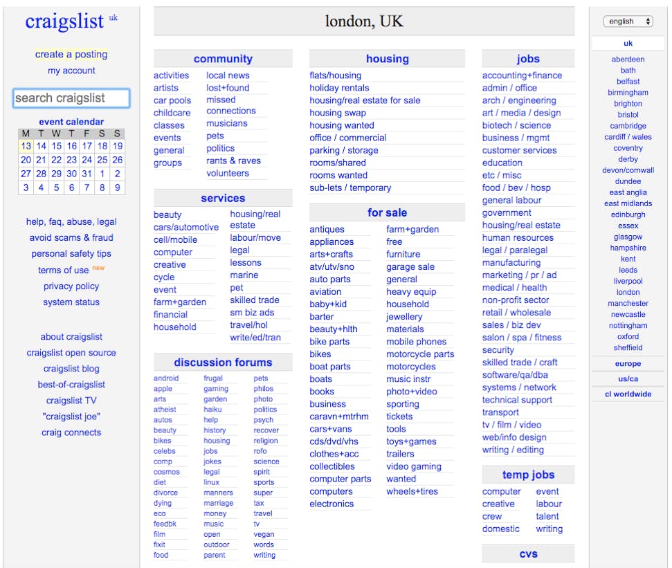
A search engine and a few other features were added at this time, but otherwise, the site was nothing more than its name implied – just a list of user-written advertisements; no colors, no images, no logo.
When you open the site, you just see a grid list of categories to click through on an otherwise-blank page. This iconic layout hasn’t changed much since the service first went onto the internet and while Twitter and Facebook update their interface – to common dismay – every six months, Craigslist is entirely resistant to change.
Despite this, Craigslist is the 121st most popular site in the world, according to Amazon’s Alexa rankings (nothing to do with the voice assistant). Estimates suggest the site gets 50 billion views a month and hosts 100 million adverts at a time.
You what?
Let’s take a moment to process that. A site that’s in the global top 150 – top 20 in the USA – has no design work. It has no logo, no branding, no fancy CSS, and — aside from the ad category taxonomy — all the content is user generated and largely unmoderated. If all sites on the internet were like Craigslist, we would all be out of a job.
Infrequently, Craigslist comes under fire for the number of illicit services that people advertise on it. Craigslist’s response was not to add a complex moderation algorithm, but to remove the category for adult material; removing their support of such services, but still placing the onus on the user to self-moderate. Craigslist is as hands-off as a site owner can be. Minimum effort, but still one of the most successful websites in history.
Is this proof that all of our work is fruitless? Are site owners just wasting money by hiring designers and developers and copywriters and UX researchers? Thankfully, no.
No-design design
Craigslist is not an example of the ineffectiveness of web design, but an example of a truly genius design reaping amazing rewards. Think about it: if every site on the internet looked like Craigslist, it would be a pretty bleak place. People wouldn’t spend all their time browsing the internet if everything was just poorly-written text and hyperlinks. Because very few other sites are like Craigslist, however, the appearance is unique and, in its own way, special.
Likewise, the purpose of Craigslist is to connect people who need each other’s services. ‘I’m looking for casual work as a gardener’ doesn’t particularly require images, video, fancy graphics or a complex UI. The design of Craigslist is just what it needs to be and no more.
Simple
You want to buy something? Click the “for sale” link. Looking to buy jewelry? Click the jewelry section under “for sale”. Craigslist is so simple, anyone can use it without explanation or assistance.
Likewise, the more elements a site has, the more that can go wrong. Craigslist is such a lean site with so few features that it can load instantaneously on any system. Meanwhile, sites with embedded videos, interactive ads and high-quality images can be an absolute nightmare if you’re trying to access it from somewhere with low signal.
Accessible
Craigslist may have started out being for web devs, but its lack of design has made it perfect for anyone who struggles with complex tech. Your older parents will have no trouble using it on their ancient desktop PC, for example; but it will also be quick and easy for the tech-savvy to use under less-than-ideal circumstances. By aiming for the lowest common denominator of technical ability, you can make a site that’s accessible to everyone.
Inclusive
Speaking of accessibility, no colors means the site works for colorblind people, text-only means it’s great for blind people using voice services to access the internet, and a click-through menu means people who need to use custom devices to control their PCs can flick through it quickly – anyone can use this site. This is lovely, but even better for Craig as it means the site’s audience is as wide as it can possibly be, and more visitors means more advertisers, which means more revenue.
In summary
So, let’s review. Craigslist has:
- A unique and innovative design
- An appropriate design for the service it provides
- A design that maximizes its audience
- A dynamic design that works on all systems
- An economical design that requires little investment to maintain
- A future-proof design that will not go out of date
No design here is a design choice, and it is the right one. That’s why Craigslist has been popular for nearly 25 years.
The lesson
So what can we learn from all this? Make every website like Craigslist? Not at all. If you’re making a website to sell luxury yachts, you want to go for a slick, well-designed site. If you’re making a site selling parts for custom gaming PCs, you can get away with something more technical. If you’re creating a very-basic user-ad site, though, then this is all you need.
If I impart nothing else to you with this article, then please approach UX design with minimalism. Only make your site as technical and as complicated as it needs to be. Even if you build from there, only do so when your users need it. If you make your site with that principle in mind, you could still be living off the proceeds in 25 years’ time like Craig.
In this Article
About the author(s)
Related Blog Posts


Get the latest news on events, research, and product launches
© UserTesting 2024