Information architecture: a comprehensive UX guide for beginners


Information architecture is a relatively new name for a very old concept.
For hundreds of years, journalists have been presenting information in news articles in a way that makes them simple to read and easy to skim for the necessary information.
Any journalist can tell you about the inverted pyramid, whereby the important information should be at the very top as a brief summary of the key points. Thereafter, you repeat and expand the same story, but adding in additional contextual information. Then you repeat with different information, all the way down until you have conveyed every detail.

This way, your reader can read any number of the paragraphs of your story and come away with as much information as they need. With the advent of digital design, UX and web copywriting, these principles have been applied in the same way, but with more iterations and flexibility.
What is Information Architecture in UX design?
In the world of UX, Information Architecture (IA) refers to the way content is presented and accessed from any given page on your website – whether through menus, breadcrumbs, categories, or links.
A good IA can help people on your site understand where they are, what’s around, and what to expect.
Information Architecture typically focuses on:
- Structure: the way information is laid out i.e. people should be able to predict where to find what they’re looking for
- Organization: grouping information in a way that makes sense to people
- Labels: ensuring elements are appropriately titled so people can find information
There are an unlimited number of ways to use a webpage to tell a user what they need to know, so how do you know which is the best way to present the information on your website?
What do your users need to know?
The first question you should ask when embarking on information architecture optimization is: “What do your users need to find out from your website?”
This is when user research comes in.
Set up a focus group with a sample of your target market (this can be done remotely using online screen-share technology) and interview them. If you’re selling them a product, ask them what questions they may have about what you’re selling. If you’re giving information about the town library, ask what they might need to know about it. It’s one of the simplest kinds of user research you can do.
Next, you need to come at the question from the other side. What do you need to let your users know? Is there information they don’t know they need? Do you have terms and conditions or security details that you need them to know?
Take some time to brainstorm these ideas, come up with as many as you can, even if you’re unsure if it’ll make it to the final site.
Pick a card, any card
Break down your ideas into the smallest nuggets of information possible and write them out on a set of cards or post-it notes. For example, contact details should be broken down into phone number, address, email, etc.

Once you have a complete set of cards, you can repeat the process with both an external and internal focus group. With each group, go through the cards and discard the ones they think are unimportant.
Don’t be tempted to discard cards until this stage and keep the ones you get rid of separately. Better to choose among a large group of options than assume something’s not necessary without consulting your users. Likewise, you may need to resurrect something later.
This whole process is called Card Sorting and it should help you create a logical and user-centric way of navigating your site.
Information by any other name
Knowing what information is needed on your site is just half the battle. You also need to know how best to display the information, as there are many more options available to you than just print:
- Text is the simplest and is easy to absorb during any circumstance. However, a picture says a thousand words and it’s not always easy to describe processes and technical details in just a few sentences. Equally, do you have a single paragraph on a web page or do you provide your user with a downloadable 17-page PDF?
- Audio might be useful to describe how to carry out a complex process the user can perform along to the sound. It does, however, require either headphones or a private space, and again, it’s harder to explain than show.
- Images can show which buttons to push or how a hotel room looks, but they can’t display context or non-visual information. Also, they may point to where the volume button is on a phone, but it might be hard to show how you need to hold the button down in a picture. A more-modern option for this is moving images, such as GIF files, but these can be limited and may not be to everybody’s taste.
- Video is a very useful tool for showing exactly what your user needs to do step-by-step, and offers a full audio-visual experience that can include friendly presenters, on-screen text, music, animation, special effects – the whole shebang. It also, however, takes data, headphones, a reasonably sized screen and the time to watch the whole video. It’s also difficult to scan through. If you miss a step or want to check a piece of information, you likely need to go back to the beginning, and it’s near impossible to skip forward to a specific piece of info you need without knowing where it is in the video.
If you’re showing your user how to construct a piece of flatpack furniture, video will show them exactly how to put the pieces together; while if you’re listing all the different services that your site offers them for purchase, you’re better off with text descriptions. On the other hand, if you’re selling different colors of a pair of shoes, you need a series of images. Ask your users which type of content works for each piece of information.
Once you have a set of cards you all agree are needed, and you’ve marked out what kind of content conveys the concept best, try to group them into similar categories. This is where your phone number and email can come back together under contact info, but don’t merge them until here, as you may decide the address isn’t needed, for example.
If possible, try to put similar content types together – it’s not essential, but it’s far easier to merge blocks of text or make a carousel of images.
Hierarchy of needs
When you have your categories, start putting the info into a hierarchy.
You’re more likely to Google the opening times of a supermarket than the name of its manager, for example; or you would probably need to know how a new app works more than you’d need its copyright information. It may help to assign a number to each piece, one for headline information, 10 for something that might be useful only on occasion.
From there, you can start building your site structure. This might be something you have time to do with your user focus group or it might make more sense to retire to your secret lab. Either way, this is when you can start building out a mock-up of your site.
Rewrite your cards according to categories so you might have a "contact details" card with "email" and "phone" written on it, or a "user manual" card with "download instructions" and "how to log in" written on it.
Keep your priority numbers on these and then average them out and give the new card a priority as well. Address might be an 8, but it would be on the card with email, which could be a 1, and phone, which might be a 3, so the complete contact details card might work out as a 2 overall, for example.

Making your wireframe
Take your new cards and stick them up on a wall, lay them out on a table or use online software so you can move them around and see which make sense together. Try to group all your highest-priority cards, but this is where you can start to think about how much info you can fit on a page and how you would follow from your homepage down to the information you need.
Start to build links from one group of cards to another. Your user will need to get from your homepage with your top-tier info, to pages with second-tier information, and so on.
It’s not a hard-and-fast rule, but try to imagine your priority number as an amount of steps or clicks. Your 1-priority information should ideally take one click or less to find and your 2-priorities should take no more than a couple clicks, but you may not mind your users clicking around a bit to find an 8 or 9.
Once you’ve grouped your cards into pages, start looking at the priority of the cards on the page and think about where the information should go. Are they better at the top of the page, in the centre or in a bar on the side? Think about that inverted pyramid again, but also size, with more important information taking up more space.
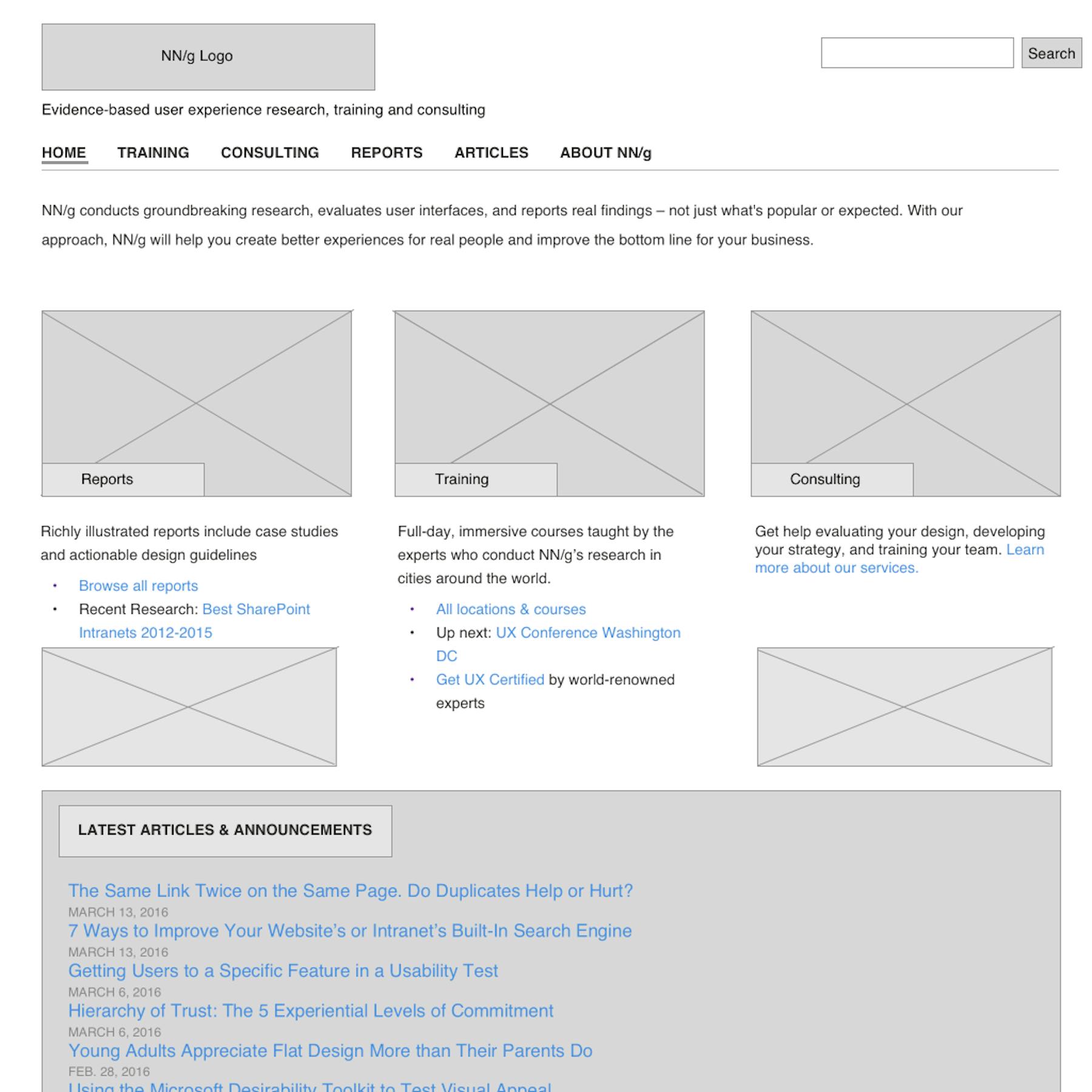
Example of a standard wireframe from NN/g
Once you’ve done all this work, you basically have a wireframe of your site all ready to fill up with your content. Using this method, you can be safe in the knowledge that your site will have a fully user optimized and tested structure to support your user journeys, before you’ve even started building it.
Building your vision
"Information" is a given, but there’s also a reason we call this process ‘architecture’. Building a site that’s both functional and aesthetic is an art form and one that your users will truly appreciate. Best of all, your users will do most of your work for you. You simply need to turn their needs into a reality.
There’s definitely a talent to it, but it’s also not brain surgery. Once you’ve done it a few times, it will become second nature, which is good to know, as it’s pretty much the most essential part of UX.
Every site needs to offer information, no matter what it’s for, and an essential detail being hard to find will absolutely destroy your UX. Alas, IA is also the one thing I see designers getting wrong more than anything else. Get your IA process right and you’re already most of the way there, so get your cards out and get going.

Get started with experience research
Everything you need to know to effectively plan, conduct, and analyze remote experience research.


