What are mental models and how do they help UX design?


What is a mental model and how does it relate to user experience?
It's a good question, one worth tackling if you want to improve as a UX designer or researcher.
The concept of mental models is part of Gestalt principles of perceptual organization, Hofstede’s theory of cultural dimensions. Although that may sounds complex, these mental models can help with the visual representation of your digital products.
In those guide, we'll dig into mental models, what they are, and how they can use them? Much of the information in this article was provided by UX Researcher George Kalyvas, who recently conducted a webinar on the topic.
What is a mental model?
Mental models derive from the way humans perceive the world around them. They are developed from observation, perception, immersive experience and, most importantly, culture. Mental models are beliefs based on cognition, rather than facts.
For example:
If I ride my bicycle really fast, then hit the front brake, I know that I will fly over the handle-bars because of my personal experience, observation of others, and knowledge of the way the brakes work. This is my mental model of this particular system.
Within UX, mental models can allow developers to understand and analyze problems in an interactive design. The reason that people make mistakes when interacting with a product is often because their mental model is different to the developer’s mental model.
Since all people perceive the world in an individual way, all users generate individual mental models. The challenge here is to ensure that developers build a product with the users’ mental model in mind.
Mental models tend to differ between different countries and cultures. So, to take the bicycle example, in the UK a front brake has to be on the right handlebar (both for reasons of expectation and legality), however this is switched around for the US and Europe.
This is also true of the web.
Take a look at Facebook in two different territories. The first image below is a Middle Eastern version of the sign-up page. The second is the UK version.

People in the middle east write from right to left, whereas people in the west write from left to right. Developers need to understand this in order to build a usable website.
How mental models can be applied to UX design
Let’s begin our journey by understanding Gestalt principles of perceptual organization. This is a school of thought that allows us to see the way that people structure the environment and perceive it.
Principle of proximity
If you look at the image below, you can see how in the first group of dots we perceive them to be in the same entity. But in the second set of dots, we perceive them to be two separate entities because of the small gap.

In the webform below you can see the principle of proximity at work in a negative way. Each cell looks like a separate entity, when in fact they’re all related.

For a positive example of the principle of proximity, look at the following webform from Github…

You can see how the red blocks make the three separate entities clear. The three text-entry fields form one entity, the headline and introductory text is another entity, and the third is the sign-in CTA.
Our own brains have created these rules, and if you’re a designer, it’s important to know how this placement affects usability.
Principle of similarity
When shapes or colors appear similar to each other, we group them together. Not only that, we assume that these similar things have the same functions. For example, in the image below the squares are all separate from each other. However, when we look at the image we mentally group the squares with the same colors.

In applying this idea to UX design we can look at hyperlinks. We understand that anything formed of blue text is a hyperlink and and assume its function is to open a new browser tab. The same thing occurs with the green CTAs in the image below.

Principle of common region
If you separate the elements so they form a group we can perceive each group as being a separate entity.

Take Pinterest as an example, where although any given pin’s image and text are clearly different elements, thanks to the dividing lines we know that they belong to the same entity.

Principle of continuity
This is one of the most important and common principles. In the image below you can see this at work. Although the intention of the lines is to follow the color structure, our brain prioritizes following the form of the lines. Structure is more visually significant than color.

In Netflix you can see this applied, with the slider function that lets you cycle sideways through the listings.

Principle of closure
Where elements have a specific distance between them, they generate a shape that our brains translate into a solid form. Check out the zebra below…

Or the IBM and Adidas logos…

Principle of focal point
When just one of the elements has a different shape or color, our brain prioritizes this distinguished element over the others.

This can be used to make specific CTAs you want to drive people towards, i.e. log-in or sign-up buttons. It can help guide the viewers eyes to what you want them to see first.

Hofstede’s cultural dimensions
Based on analysis of an IBM survey of employee values in the early 70s, Hofstede discovered that there were significant differences among cultures in different countries and he defined culture as a set of shared characteristics, such as thoughts, values and behaviors.
Here’s an example of this at work…
Take a look at the homepage below and try to answer the following questions: where is this website from and what is the purpose?
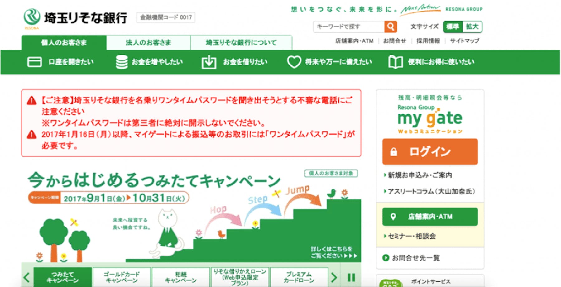
We asked these questions of our webinar attendees, and although most guessed the correct country (Japan) many were way off with the purpose. Incorrect answers include ‘gardening’, ‘a version of Amazon’, ‘kids video game’, ‘document storage’, ‘environmental’, and ‘business cats’.
Many of these are examples of common mental models – people see the green and assume something garden or environment because of their own experience within our culture.
However this homepage is in fact a banking website. Our idea of what a banking website looks like in the UK is very different to how a banking site looks in Japan. Here’s a typical UK banking site.

If you asked a Japanese web developer to build a banking website for a UK audience, their cultural perception would be very different to what the UK audience expects.
Hofstede’s cultural dimensions are split into six categories, and here is where we measure the difference between cultures and countries.
- Power distance
- Uncertainty avoidance
- Individualism vs. collectivism
- Masculinity vs. femininity
- Long vs. short-term time orientation
- Indulgence
The last two have been added recently by other thinkers, but for our purposes, we’ll only be discussing the first four theories.
So how do these dimensions come into play with user experience design?
Just as a caveat, these are generalizations of the countries and cultures and are based on Hofstede’s theories. They do not necessarily reflect our own thoughts or experience.
Power distance
This is the extent to which the people of a particular culture are willing to accept unequal power distribution.
Countries with a high power distance tend to experience:
- Centralized decision making.
- Management and superiors are highly respected and have the last say in decisions.
Countries with a low power distance:
- Everyone expects to share in decision making.
- Management hierarchies are flatter and more open to questioning.
In high power distance cultures, an employee will never question a manager. In lower power distance cultures, employees are encouraged to have an open dialogue with management.
For design purposes, what could work well in high power distance countries would be introducing visuals, expressions and images with authoritative body language, that are informative and guiding. Whereas low power distance cultures may prefer activities of daily life, popular images, symbols and colors.
Uncertainty Avoidance (UA)
This is the extent to which a society fears and avoids uncertainty and uncertain outcomes.
Countries with a high uncertainty avoidance tend to have:
- Strictly defined rules of behavior and formality
- Things that are different or unexplained can be viewed as dangerous
Countries with low uncertainty avoidance:
- Willingness to take risks
- More experimentation and/or innovative behavior
Countries with high uncertainty avoidance fear change and don’t like ambiguity – they also probably have more laws and legislation. Countries with a low UA are more willing to take risks and are more flexible in the way they work.
Design for a high UA culture may include:
- Simple clear design, limited choices.
- Attempts to reveal or forecast the results or implications of actions before users act.
- Navigation schemes intended to prevent users from becoming lost.
- Help systems that focus on reducing user errors.
- Redundant cues, color, typography, sound, etc. to reduce ambiguity.
Low UA cultures would emphasize the reverse:
- Maximum content and choice.
- Acceptance even encouragement of wandering and risk, with a stigma on ‘over-protection’.
- Less control of navigation; for example, links might open new windows leading away from the original location.
- Mental models and help systems might focus on understanding underlying concepts rather than narrow tasks.
For an example, check out the Starbucks website in China (a low UA country)…


There’s loads of text, lots of categories, navigation and links – it’s the maximum amount of information jammed into a lengthy webpage.
And here’s the Starbucks website in France (a high UA country).

There are fewer elements, navigation is scaled back to the bare minimum, there’s one focused CTA. The full length of the page is half that of the Chinese example.
Individualism vs. collectivism
The extent to which people in the society define themselves as part of larger groups.
Countries with high individualism tend to experience:
- Social ties that are loose
- Individuals expected to look after themselves
Countries with high collectivism:
- Individuals are strongly incorporated into groups of family, clan, school
- Government policies often favor the group over individual rights
When it comes to design, content based on materialism and consumerism will work well in individualistic countries, whereas content that represents community and harmony will work in highly collectivist countries.
For example, here’s a dating website from Venezuela (a collectivist country), full of many different faces looking out towards the visitor.

And here’s the same dating website in Italy (an individualistic country), which features a young couple, looking at one another.

Masculinity vs. Femininity
The extent to which a society favors certain gender traits.
Countries that value high masculinity:
- Favor assertiveness
- Emphasis on competition
Countries that value high femininity:
- Focus on quality of life
- Importance placed on the well-being of relationships
A website in a country that values high masculinity may favor competition and talk about how you can grow and better yourself. A website from a culture with high femininity may concentrate on wellbeing, relationships and the value of life.
Takeaways
An ecommerce store will use a trolley or a basket to signify the place your online goods are stored, because that’s what we use in the physical world. It would be no good for web designers to use another symbol – a hat, a puppy, a cog – because we’ve already built the mental model in our culture.
So you can see that mental models are handy for translating real world activities to the digital world.
When Apple introduced the iPhone and users had to swipe or tap to access features after putting in their password, we created a new mental model. Now we’re all used to entering our password at the beginning of our lock-screen. If the password appeared after the swipe – this would be an unnatural mental model.
Ultimately, the gap between developers and the users needs to be brought closer. Developers need to understand a culture’s various mental models and core values in order to truly build a user-friendly experience. As Edward T Hall said, “The information is in the people, not in your head.”


